Welcome to our advent calendar 2019! As you might expect from one, this list is growing each day until Christmas. (On Twitter, too)
⓲
Unreleased.
⓱
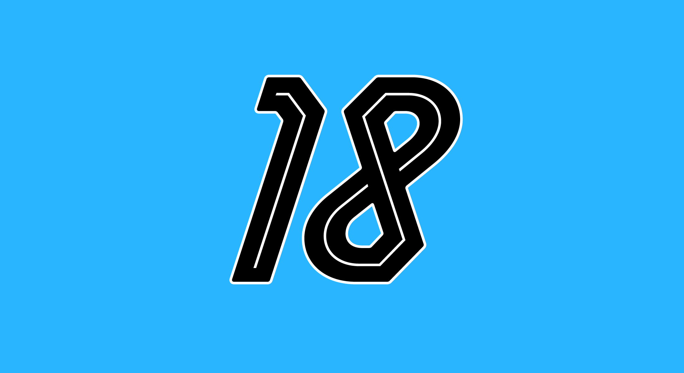
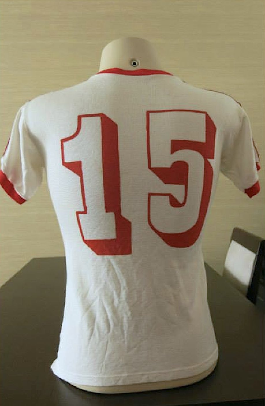
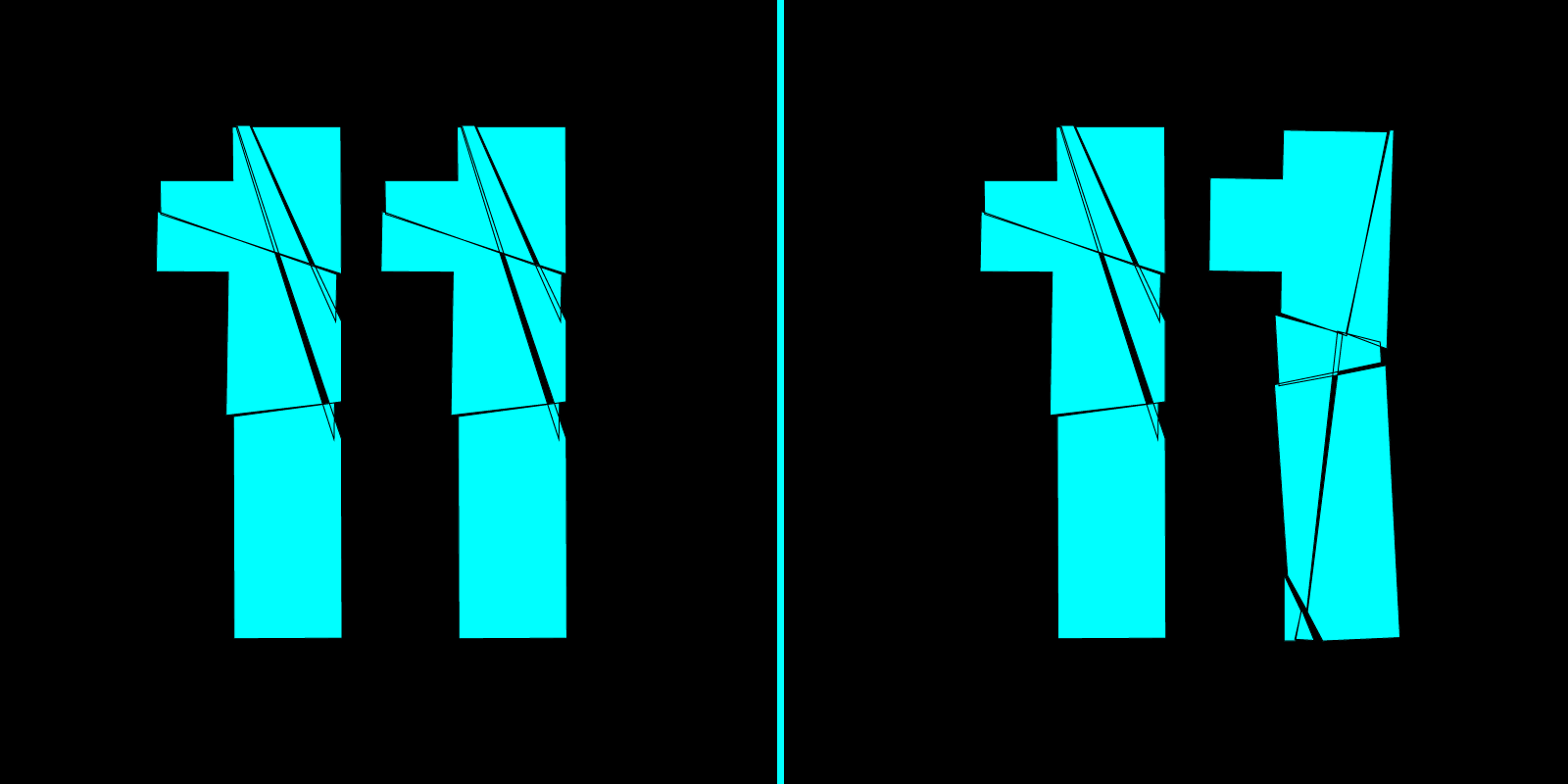
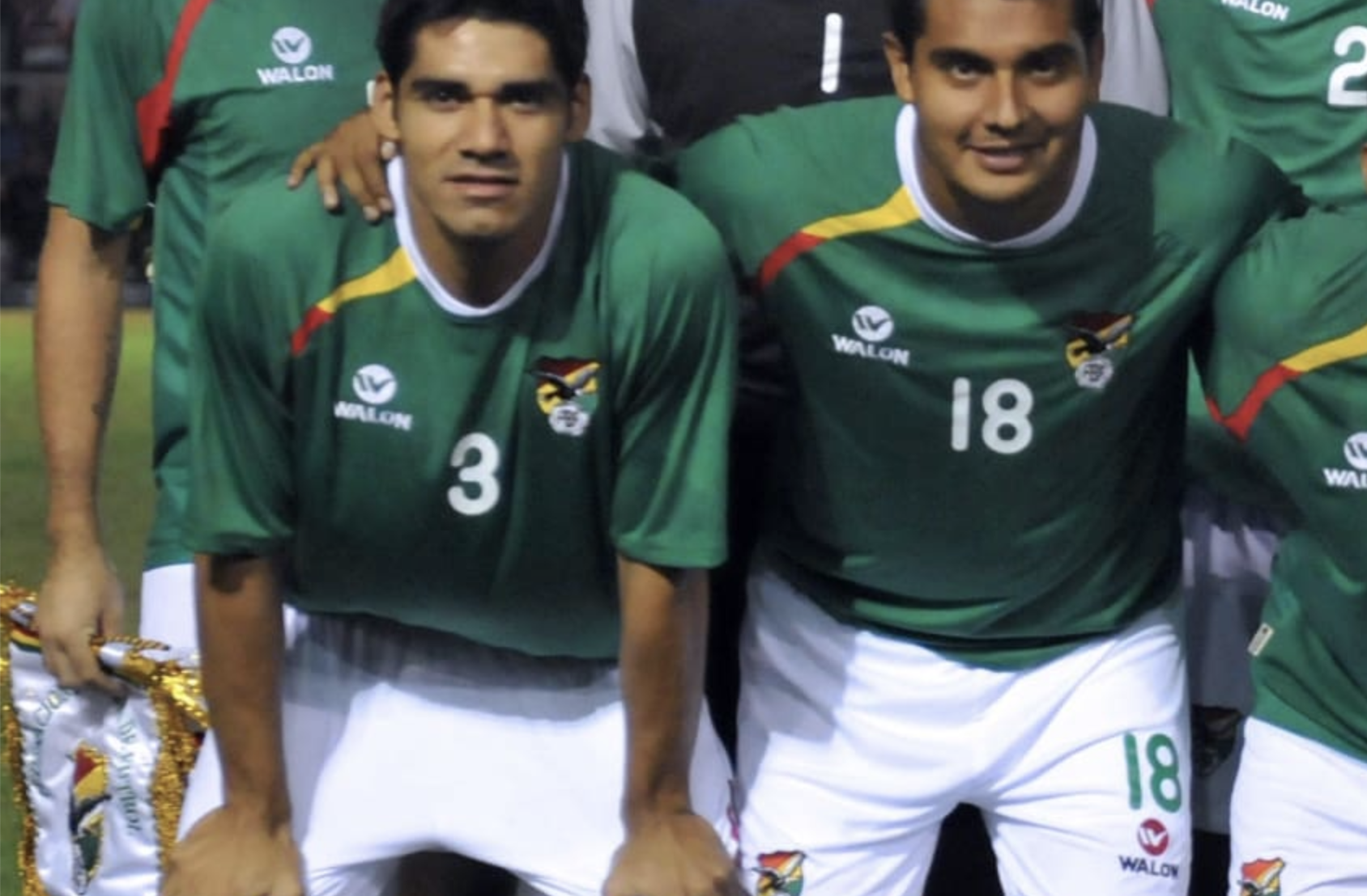
The promised follow-up to ❼: 1 and 7 have to be distinguishable. There are many possible combinations, but Adidas’s is the worst.
⓰
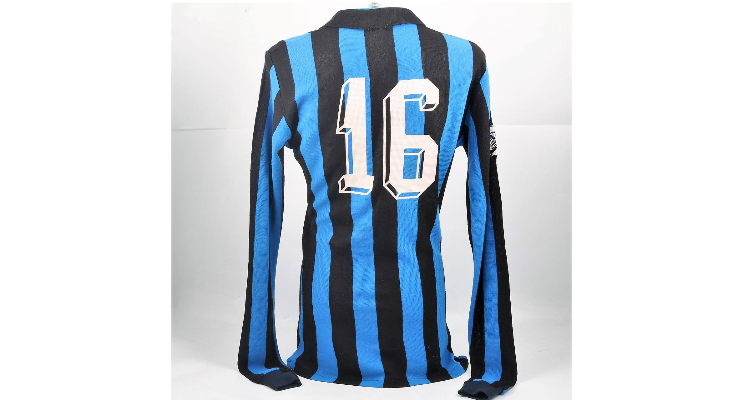
I praised this style with my free font Libero, but this 1 is amazing!
(Inter 1984)
⓯
Saw this Bulgaria 1970 (?) shirt at @_Face37. Lovely!
⓮
Not that this was readable; I’m just saying that with outlines you can do really fat stuff!
⓭
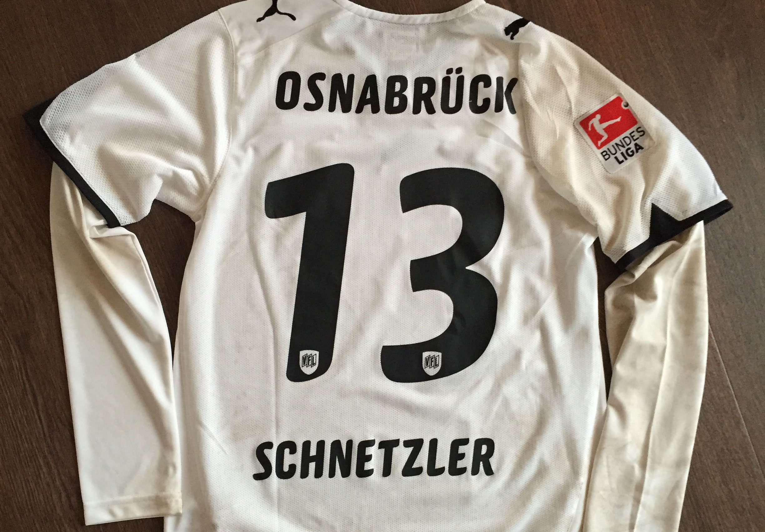
This nice typeface was created by Paul Barnes for Puma for 2010 Africa Cup of Nations – however I didn’t know Osnabrück had attended! Just one example of my collection of #ExclusiveFontJourneys.
⓬
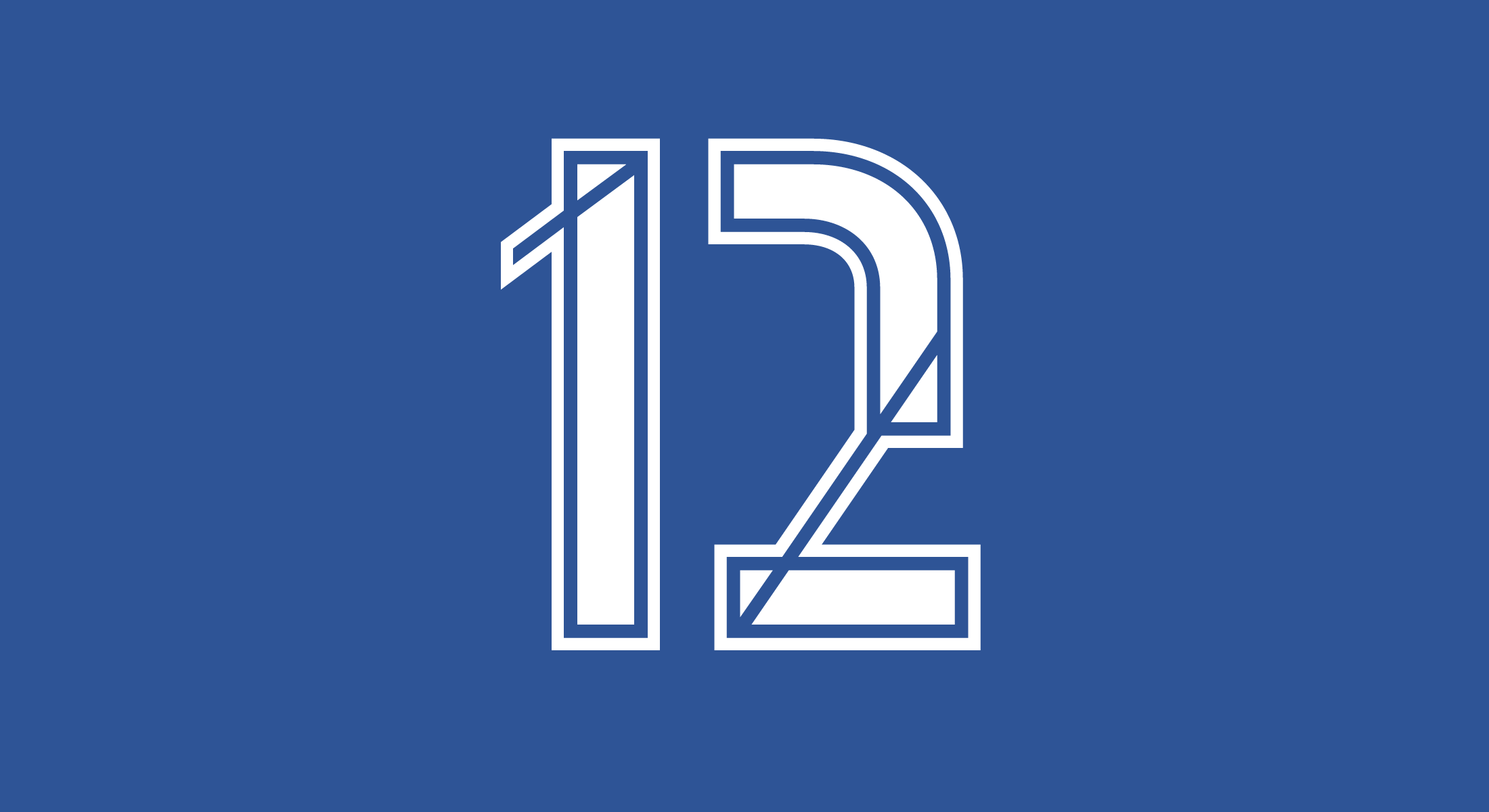
This experimental 12 might be a bit over the top …
⓫
Double trouble: If numerals have a handmade or distorted effect, duplicates should be avoided.
Left: 👎 | Right: 👍
❿
Famous number – famous style!
The chamfered design is a classic, and I praised it with my Winner typefaces. What delights me especially is the outline madness of the 90s: 4 outlines + Adidas stripes!
(Newcastle 95/96)
❾
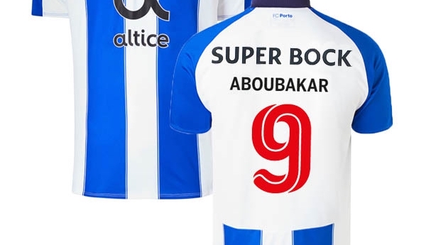
Ok, now for something positive: In 2018/19 @FCPorto showed that it doesn’t always have to be a custom typeface.
Core Escher is readable from afar but has a surprising twist from close up.
❽
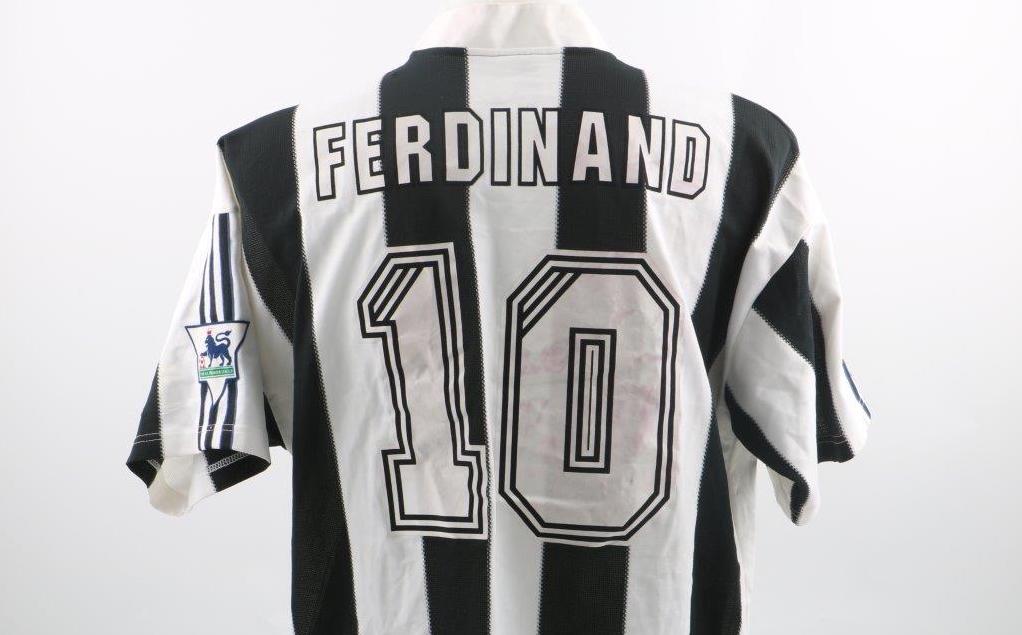
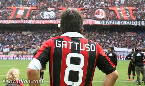
It especially hurts when a great player has to wear such an awful number. The middle of this 8 is ridiculously heavy. (@acmilan 2012–14)
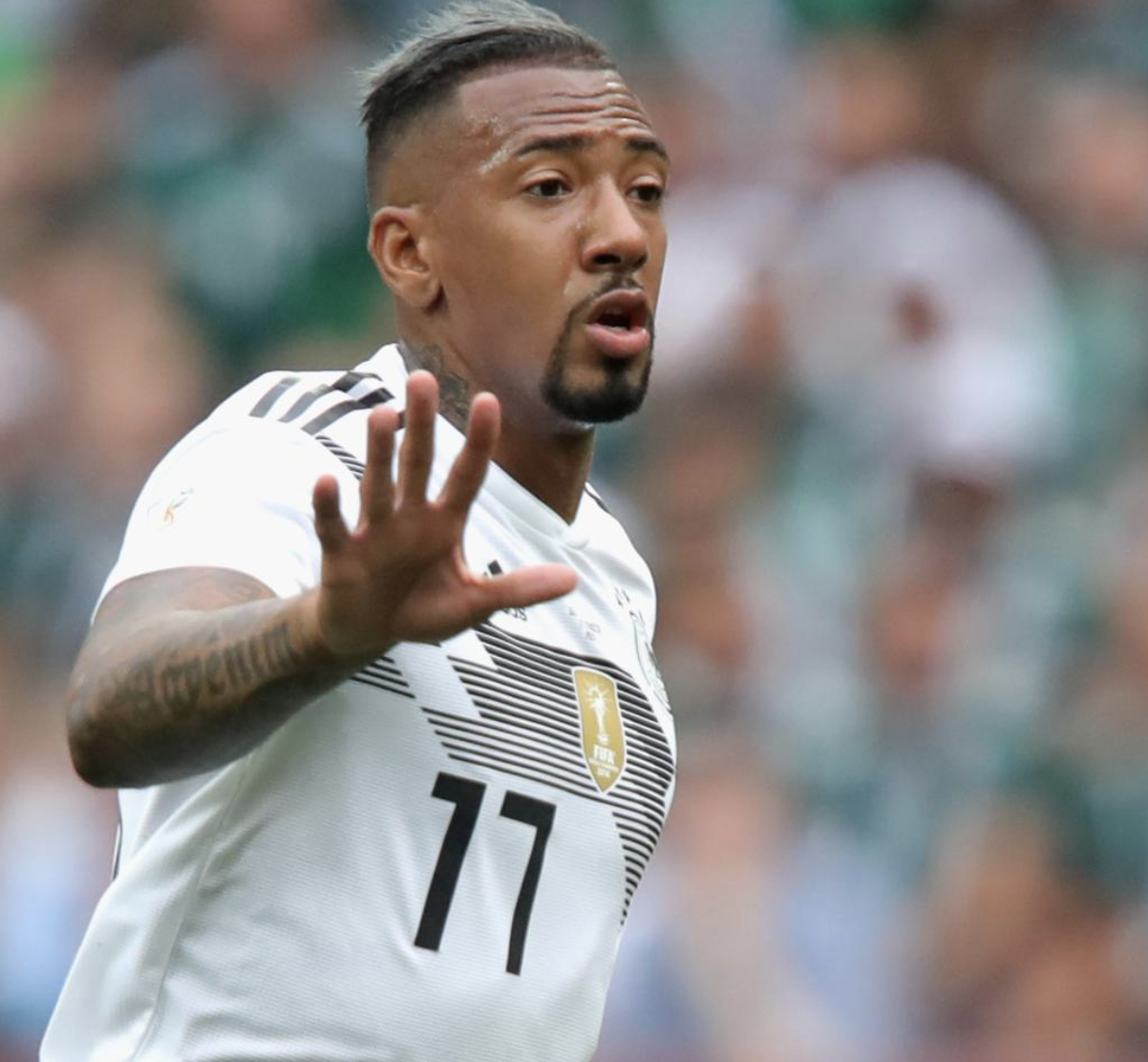
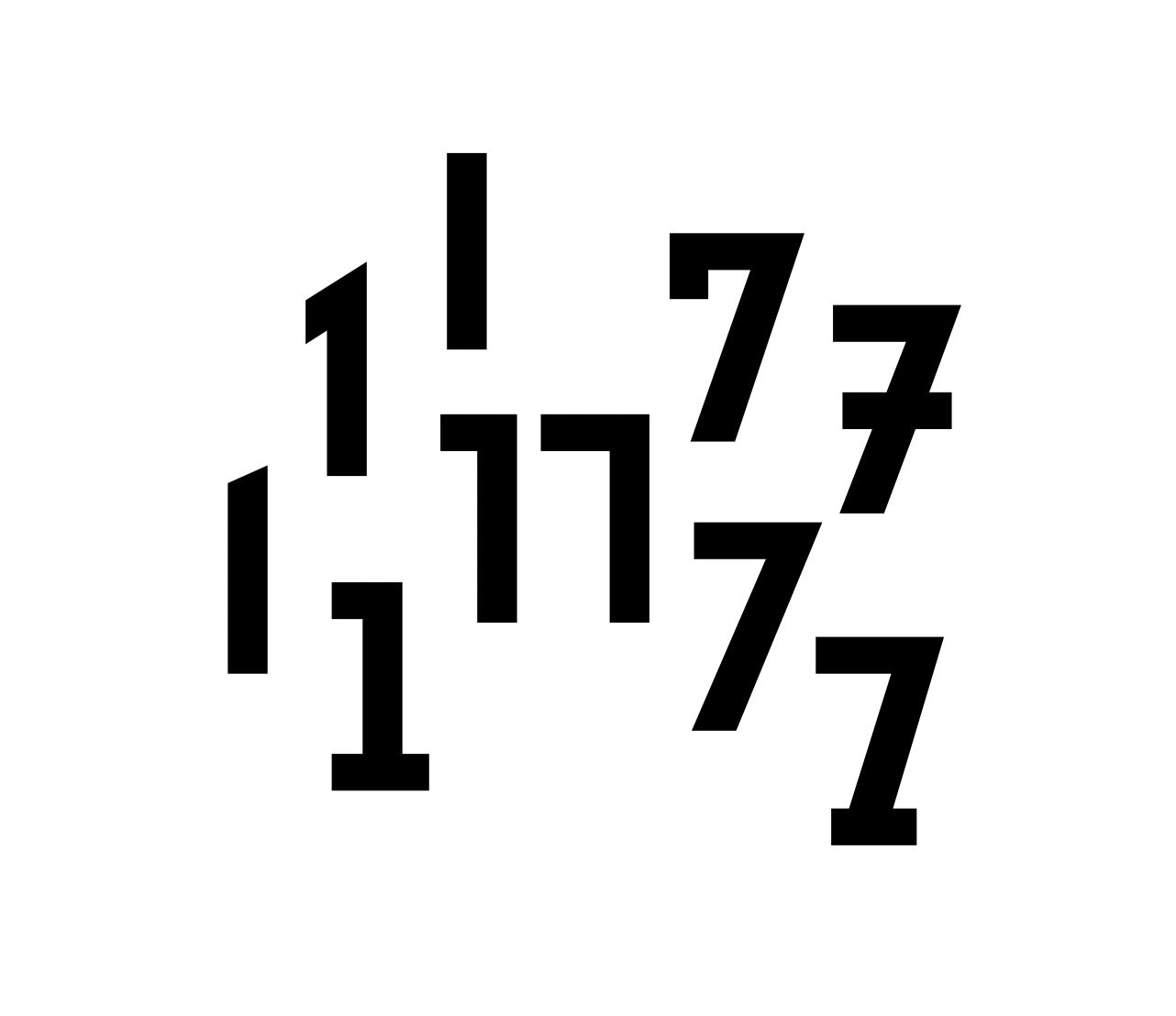
❼
Today we explore where a 7 starts and a 1 ends.
(Made with a quick variable font and Dinamo’s great Font Gauntlet)
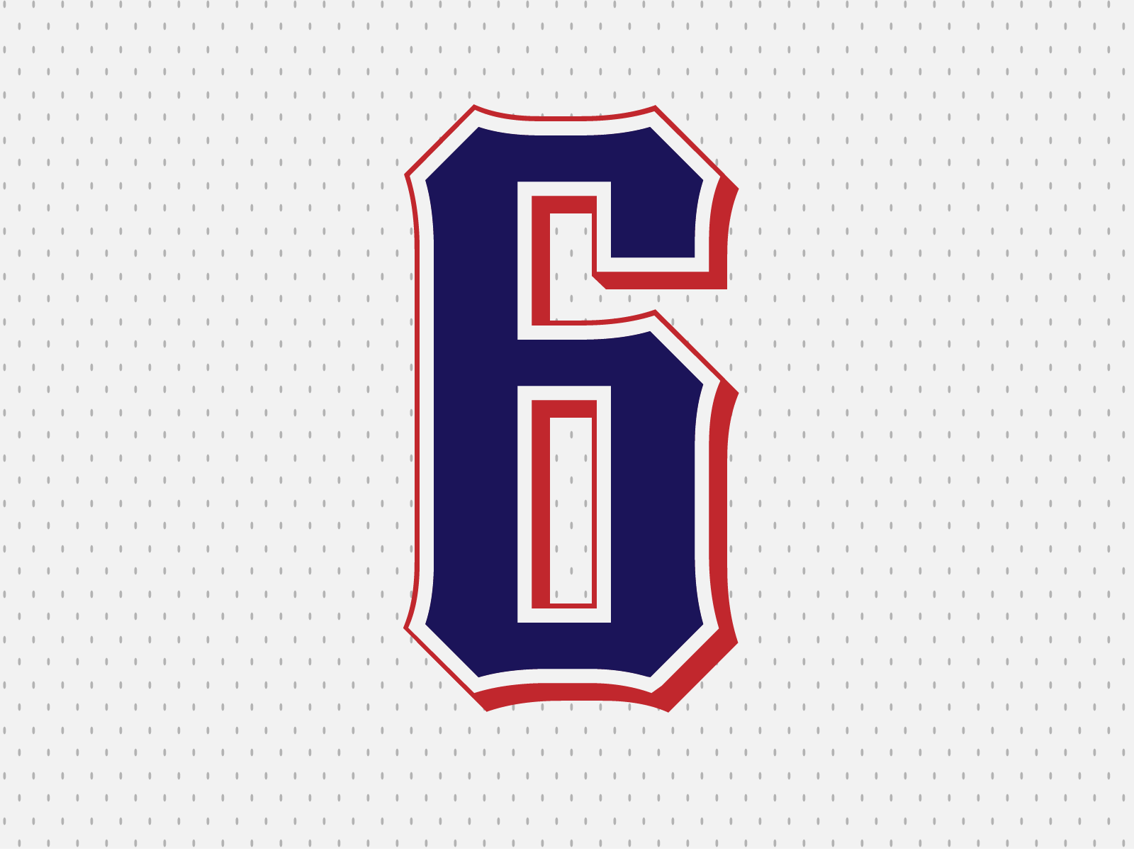
❻
American six, based on my summer holiday’s experimental variable font.
Weight 166, Width 3, Waist 60, Contrast 40, Stylistic Set 08! 🤓
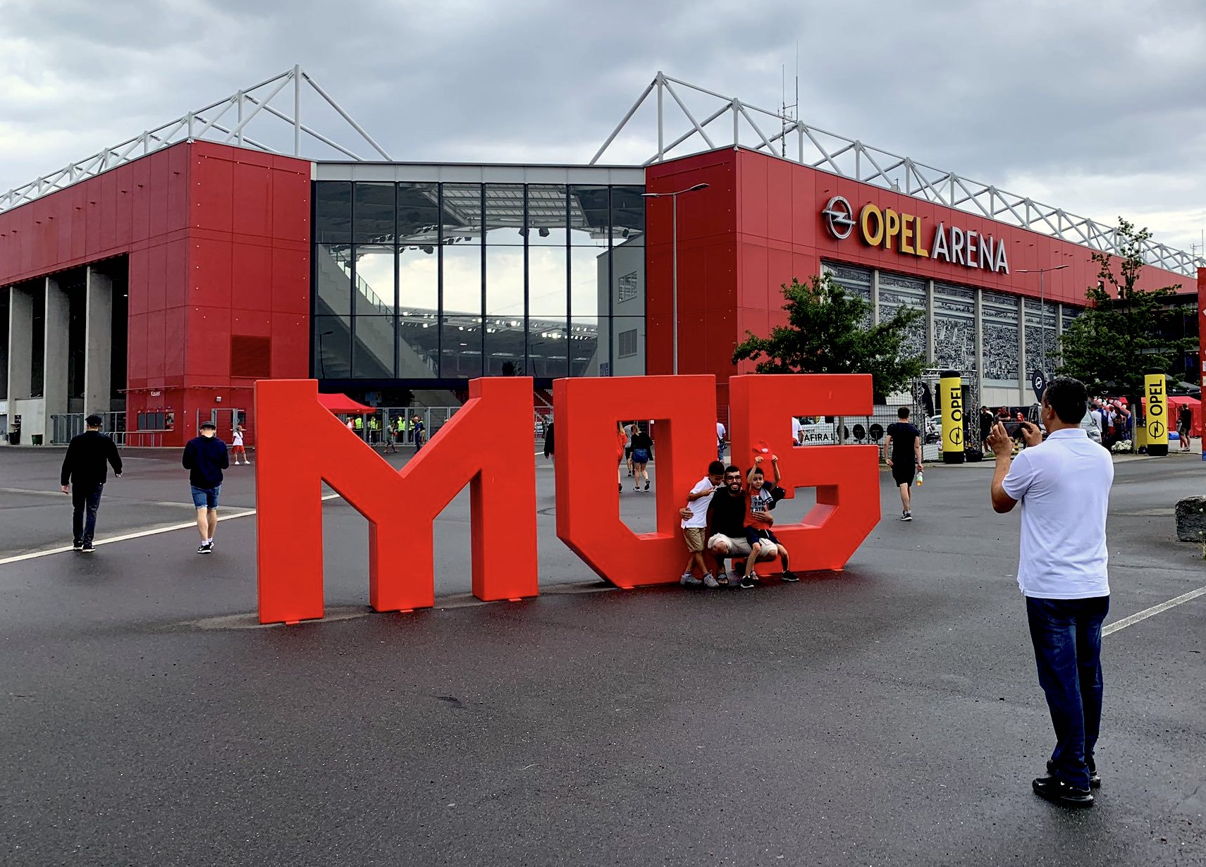
❺
5 has been special to me this year since we did a new corporate typeface for @1FSVMainz05.
I already reported about the 5 in the blog, and I was especially happy to see it in 3D.
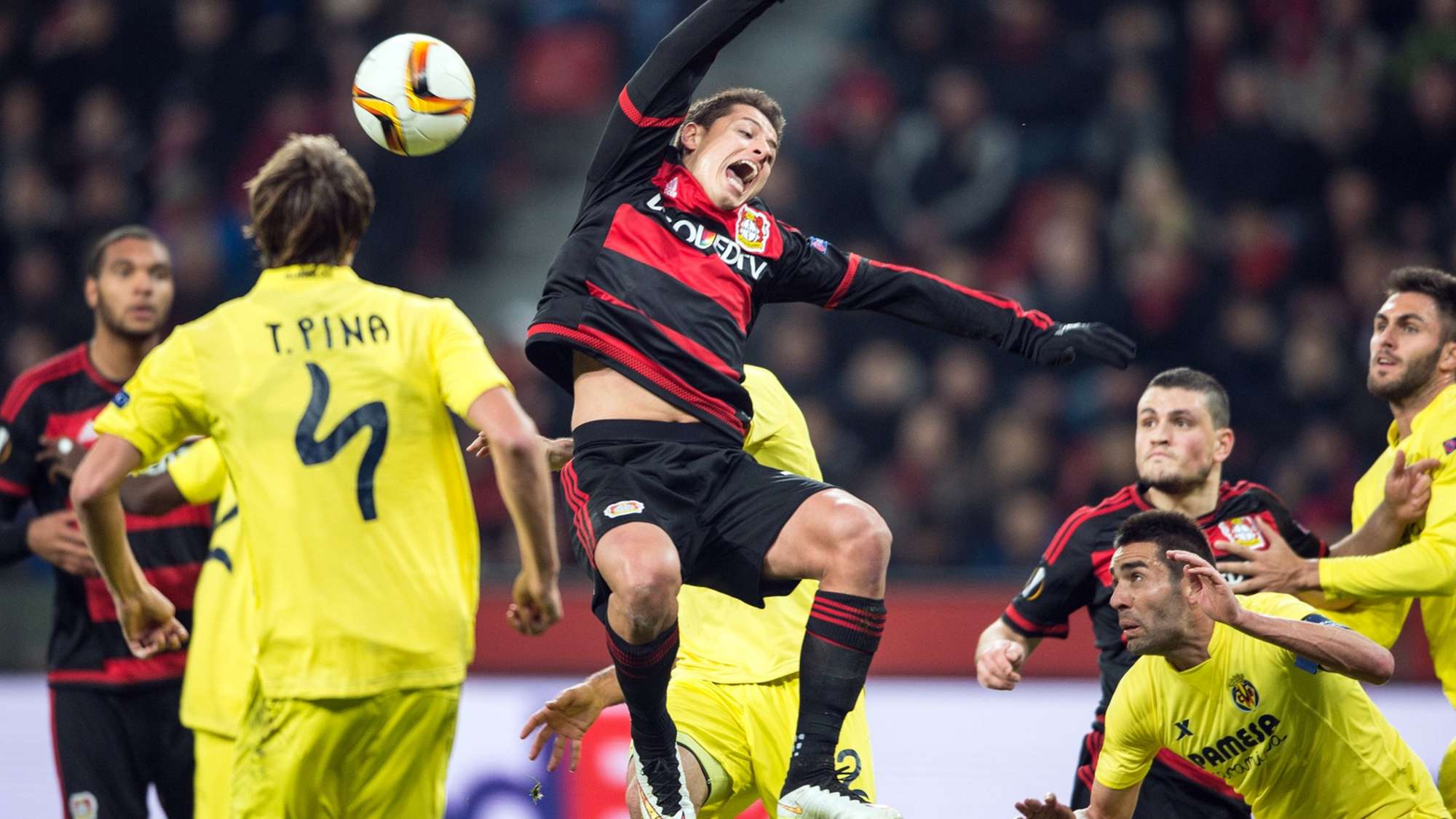
❹
Ok, time for a classic: You won’t find a 4 any worse, and Chicharito is visibly horrified!
(@VillarrealCF 2013/14)
❸
Players are moving, shirt fabric has wrinkles – therefore numerals have to be clear and distinguishable.
This 3 however (@fbf_oficial 2011–14) tries really hard to be an 8.
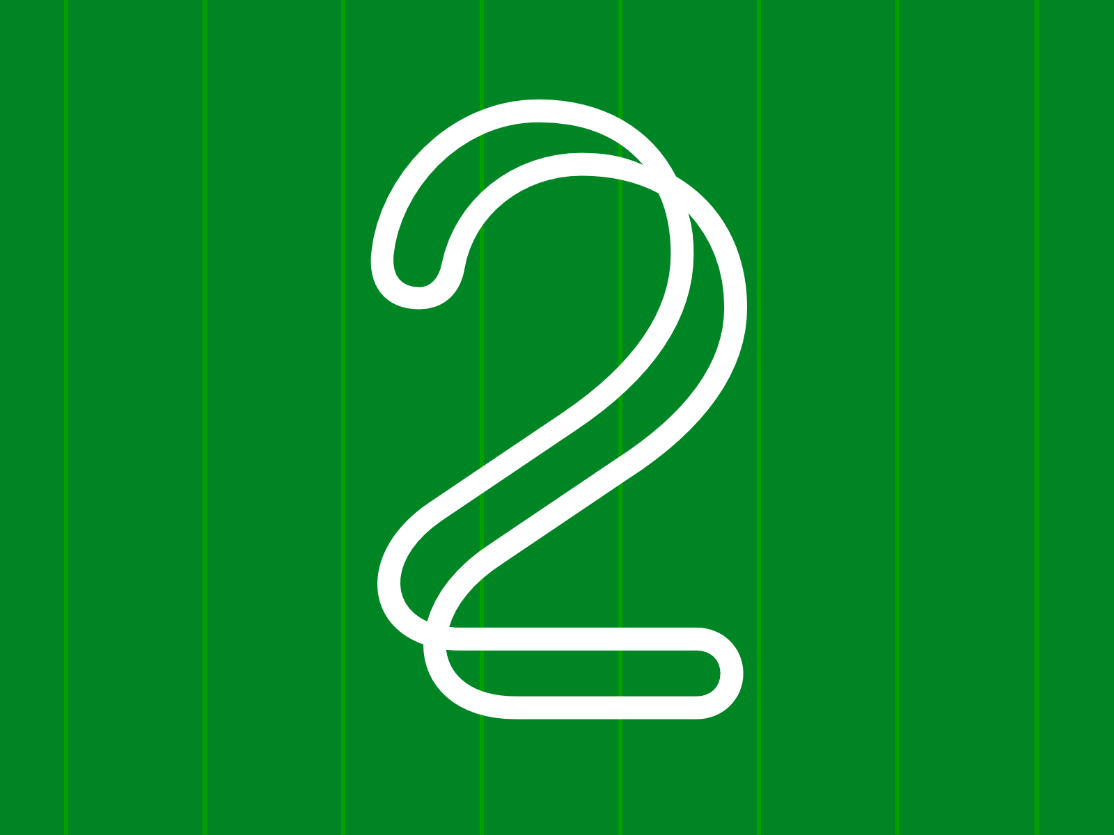
❷
This is a 2 from an unreleased typeface. You can order it as a custom font!
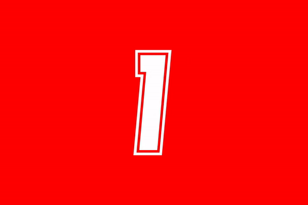
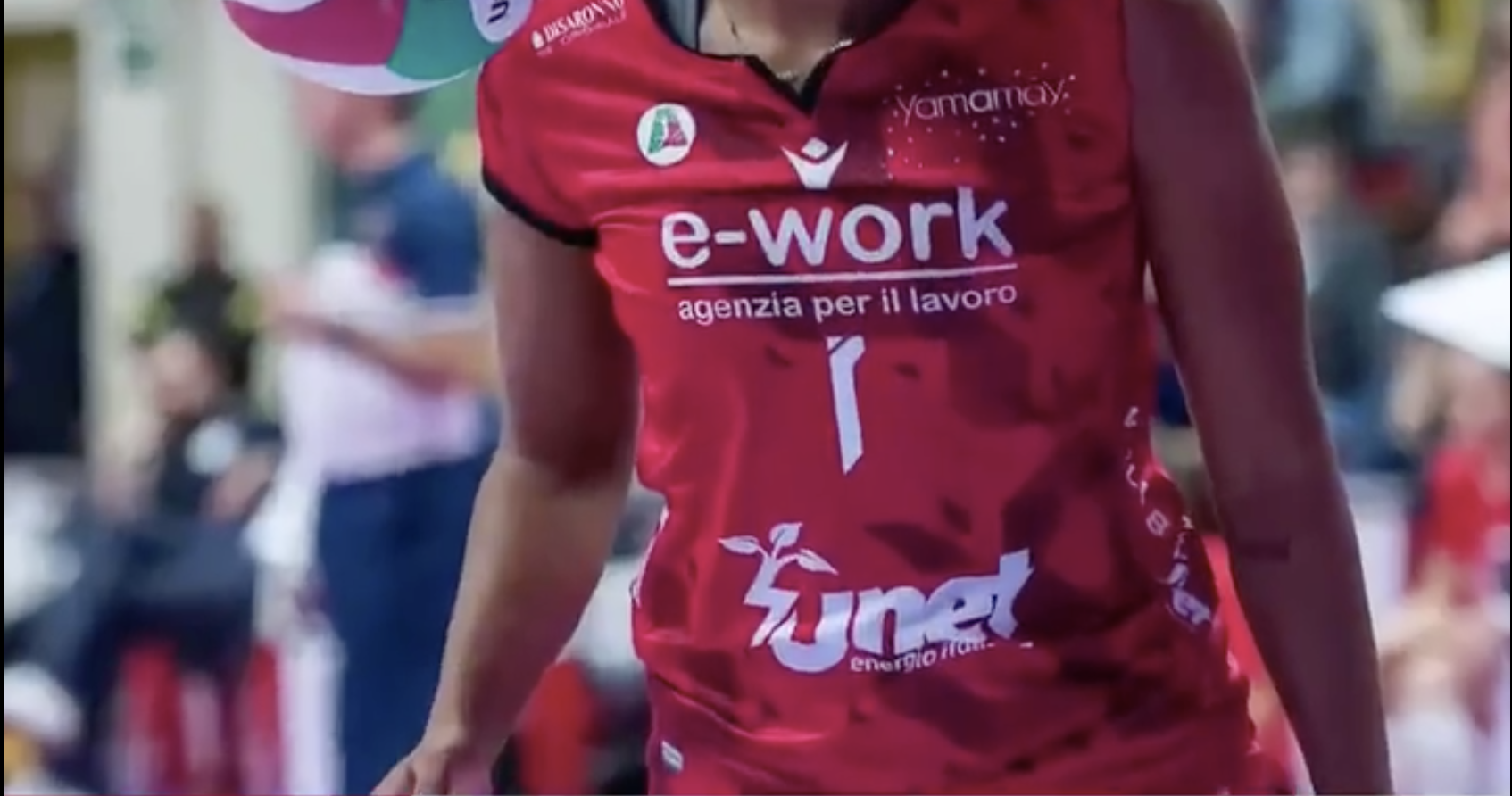
❶
A 1 is rather easy – just take a straight line, and maybe put something on the top left.
@UYBAvolley’s 1 (yes, this is supposed to be one) however has something on the top RIGHT and a dot too. Hard to beat in its absurdity!