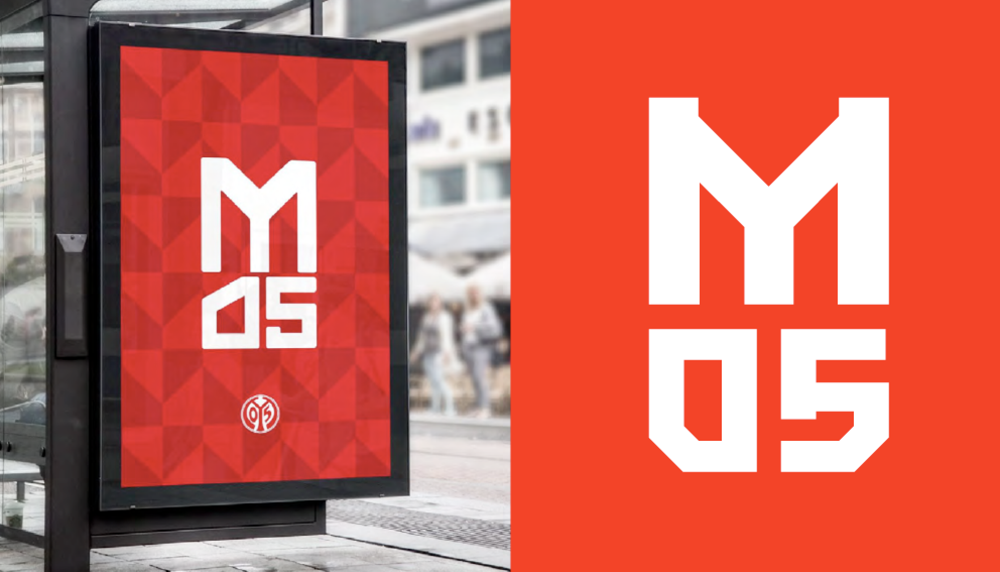
The M would be the star – this much was clear from the very outset, when Dominik Sabel of Done By People first got in touch with me to present his ideas for the rebranding of 1. FSV Mainz 05. What he had in mind was a geometric sans, obviously, but also a typeface that performs like a good squad – one that sets itself apart from the competition through a homogeneous mix of team players and a few outstanding individuals – with the M leading the way.
Initial sketch by Done By People
As one can already guess from the fact that it was a letter that provided the starting point, this commission was not primarily about shirt numbers, but rather about a corporate typeface to be used in all of the club’s communication.
I’ve long been fascinated by deformed letters in football badges. The more a letterform is squeezed to fit, the better. In this regard, Mainz, with its spectacular, barely legible M, has always been at the forefront.
“The round thing must go into the square thing” – Sepp Herberger’s famous definition of the game, applied to letterforms. This international selection features the club badges of AS Livorno, Real Madrid, Mainz 05, Rot-Weiss Essen, and Bolton Wanderers.
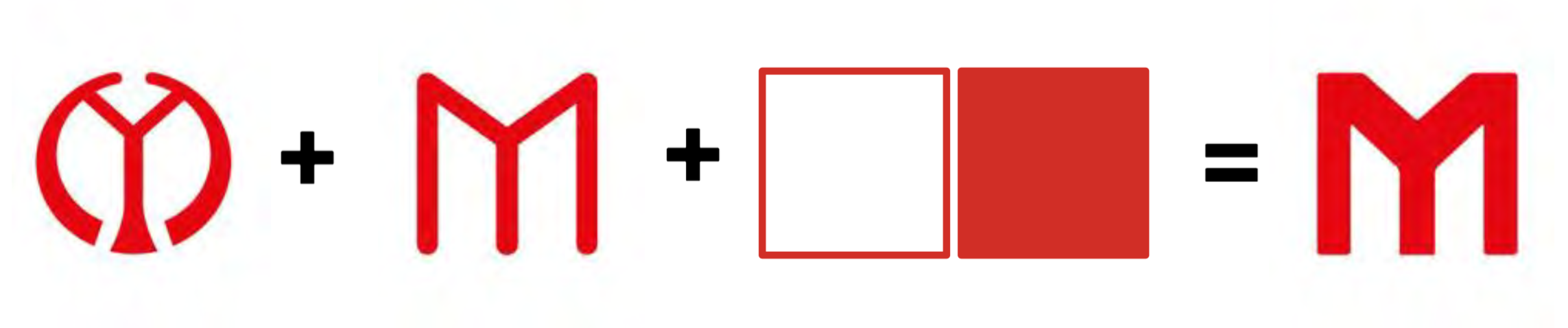
Dominik’s idea to bring the M from round to square struck me as convincing. I saw promise in his sketch – this direction would add just the right amount of ardor to an otherwise trustworthy geometric sans. We had to keep in mind that the typeface was going to be part of a greater system. The first drafts for the new club design, with their strong colors and shapes, suggested that the typography shouldn’t shout too loud. This was all the more true since we set out to create a typeface that can serve the club for a longer period of time, and that wouldn’t wear off too quickly.
In the sports sector, exclusive fonts are often made according to the principle: “Take the existing typeface, cut off some corners, done.” In contrast, I was looking for a distinct character that was not based on clumsy effects.
We had established the M as the star. Now it was time to assign roles to the rest of the characters, from down-to-earth defensive players to wingers capable of ingenious assists, in order to form a harmonious team.
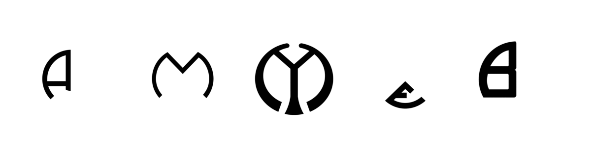
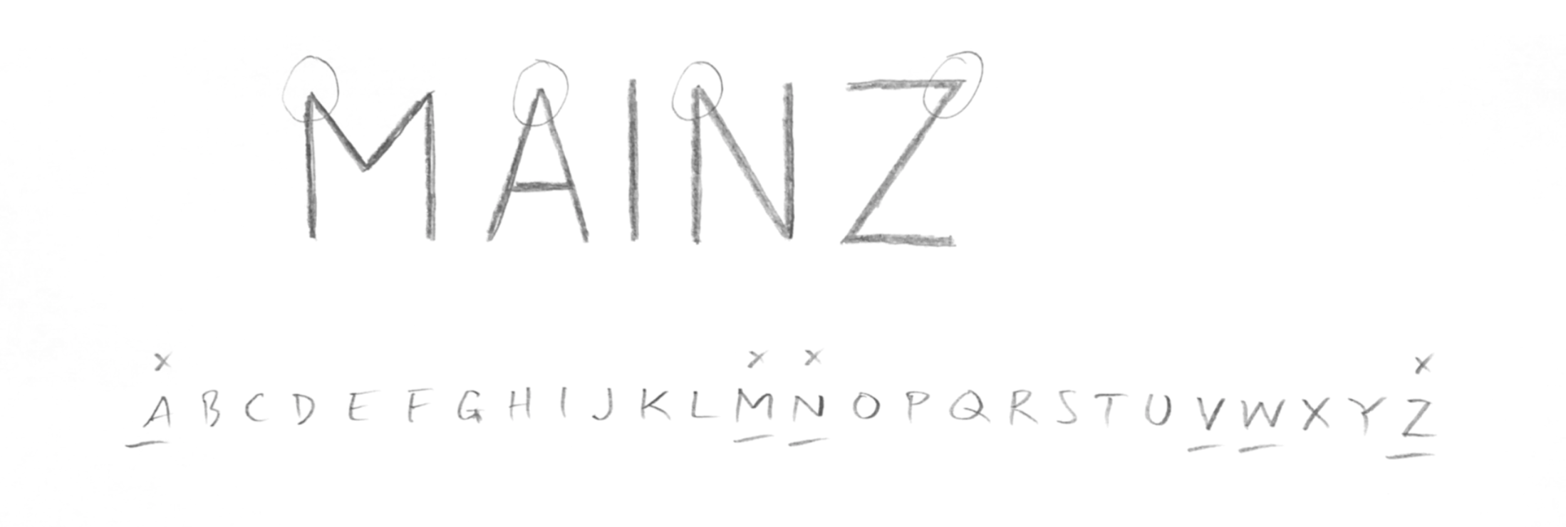
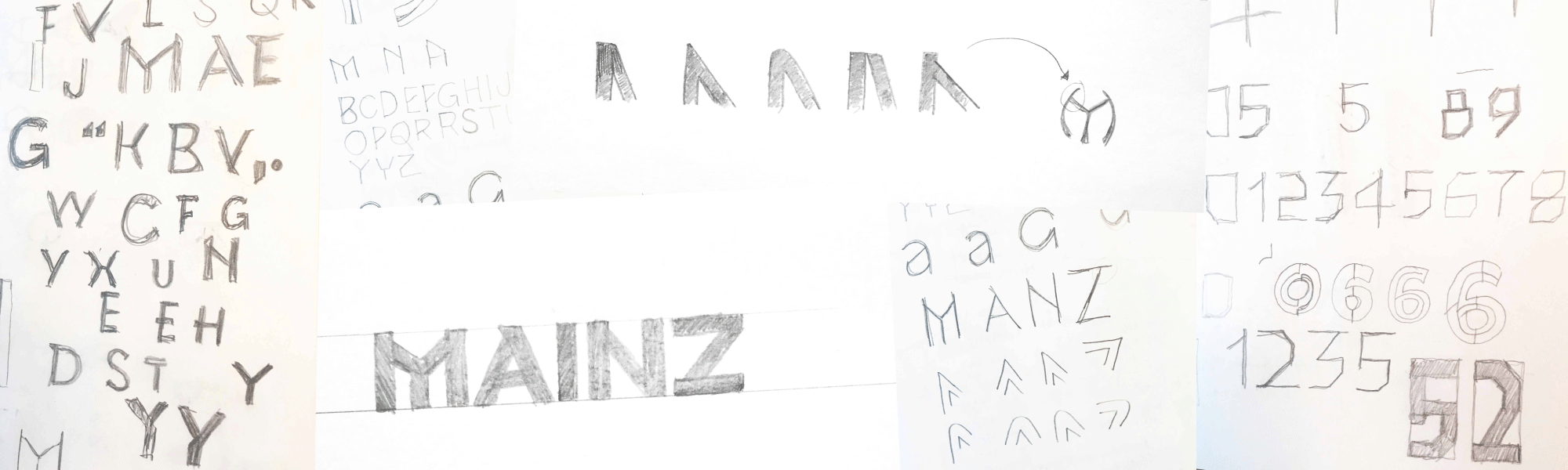
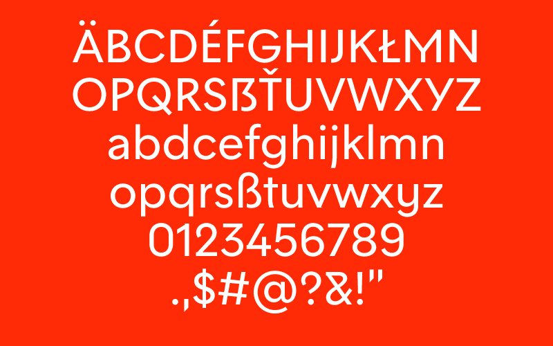
When I looked more closely at the word “MAINZ”, I noticed that it features two thirds of all the “pointed” capital letters in the alphabet. So I had a go at these vertices and tried out a few variations.
Each of the different approaches at shaping the tips drastically altered the personality of the typeface. However, only one direction was characteristic enough to distance itself from other typefaces in the same genre.
Not only is the slight offset quite original, it can also be deduced directly from the club’s badge.
With the distinctive tips, the Art Deco look of the M, and the previously used Futura as a rough point of reference, all the ingredients were in place. The fact that the typeface was devised in two optical sizes right from the start helped with making consistent decisions.
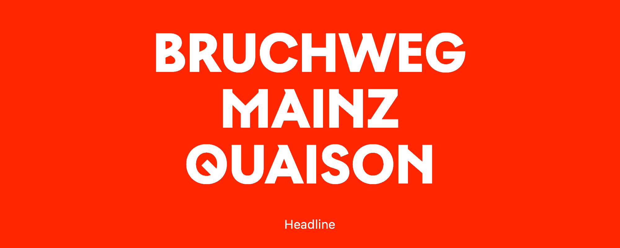
M05 Headline
Bold, compact, tightly spaced, caps only: M05 Headline represents the core of the new M05 family; the variant for all things large and eye-catching. The offset in the tips is pronounced, the apertures are kept small, diagonals are stressed. When in doubt, the glyphs here lean towards the fancy.
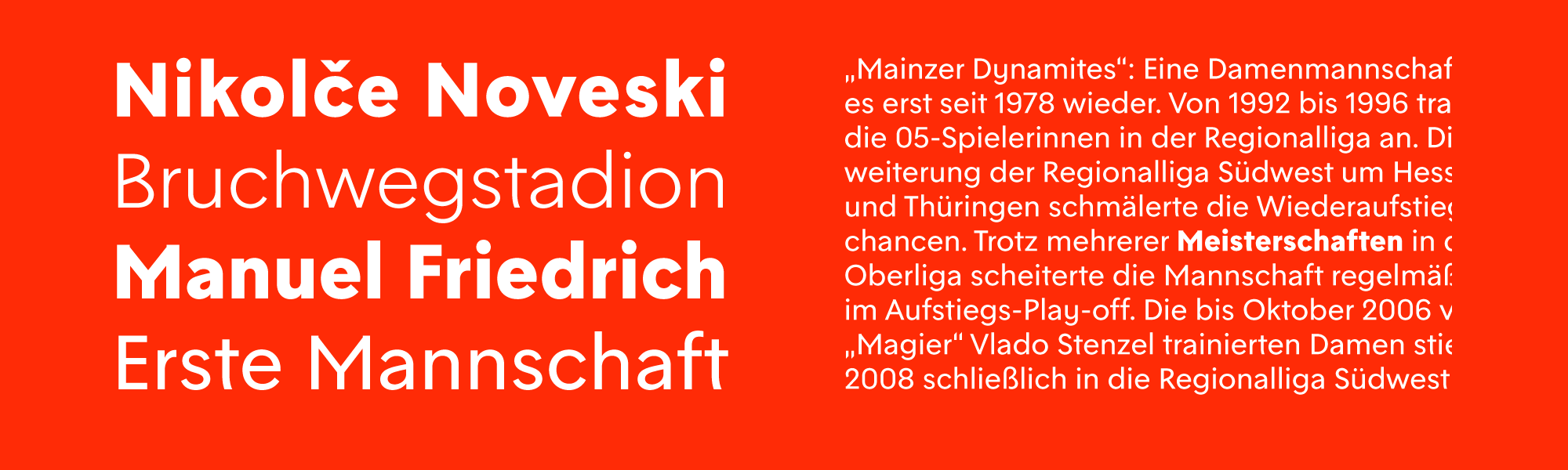
M05 Text
For longer copy, there’s M05 Text, developed in three weights. While the relationship to its big sister is evident, the extravagant letterforms and details have been significantly toned down, in favor of flawless readability. The offset in the tips is subtler, the apertures are larger, and the spacing has been opened up. With optimally readable body copy in mind (not least on phone displays), this style was drawn with an x-height that is more generous than in the previously used Futura. I also dispensed with other traits of Futura, like the closed form for a, without denying the stylistic kinship.
Overall, the text variant is a bit airier, the offset in the tips is less pronounced, and the apertures are larger. Extravagant glyphs like Q and N have been mitigated.
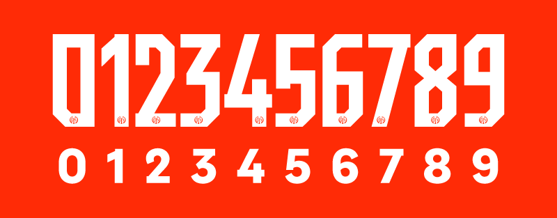
M05 Jersey
All that’s left to do is adjusting the proportions of the digits for the shirt numbers, right? Well, the client had something else in mind. The numerals should be “modern”, and that meant, above all: angular.
In the course of the redesign, we worked Dominik’s initial sketch into a kind of alternative badge, see also Letter S or Digit 5
The numerals in this badge variant were met with so much enthusiasm by the client that the design of the shirt numbers had to follow suit.
This posed yet another interesting challenge. After all, all the square numerals that I had come across so far didn’t exactly thrill me. My critical tweet about the 2018 Adidas font was shared thousands of times. Type designer Sander Neijnens showed his “appreciation” for Nike’s font for Holland 2006 (which even had similar diagonals) by recreating it with toilet paper.
So instead of striving for greatest simplicity – and therefore shapes that are neither easy to read nor very distinctive – I designed numerals that retain the characteristics of the M05 typeface and thus add to a striking overall image.